
They're Poster Boys, Jim, but not as you know 'em.
- LemonTrash

- Jan 22, 2019
- 4 min read
Hello Friendlies!
So in Episode 1 : The Footnotes, I discussed the intro, outro and interstice of the show overall, and i dropped a comment about how characters are generally arranged on posters and flash images associated with a show, and how that arrangement provides a quick visual message of who is the protagonist, what the overarching 'soul' or 'enemy' of the show/hero is, and the cool shit they want you to buy.
And guys... I've had so much fun with this.
Be warned, this post is going to be image heavy, and once more for the kids at the back, I'm no expert. This is merely my hot take on how -I- see this stuff. Anyway, buckle in, we're blasting off into a weird old place today. Let's go!
____
First of all, I'm going to make you look at this picture of 90's boyband 5ive. In fact, go look at this whole discussion thread about boybands. Just give it a scroll. Notice anything?
They're always stood in a line. No one's in the front, no one's in the back.

The key reason for this is how boybands are a product, and the type of product that they are. There's supposed to be one for every flavour. (Or as 90's band James sang 'she likes the black one, he likes the posh one, cute ones are usually gay.'). But my point being, when all of your products are supposed to be nearly equal, you don't push one ahead of the others, even in a visual still.

There's a reason the fandom loves to joke that Gundam Wing, Yu Yu Hakusho and Weiss Kruez promo art looks like boyband photoshoots - they generally follow the same design conventions. Compare that to other ensemble anime, and you tend to get a set up where one character, usually the number 1 Hero/ Main Protagonist, is promoted ahead of other characters.

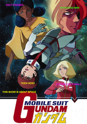
This applies often even in shows where there are only two main characters (One Punch Man). Other conventions include the use of a symbol or such in the background to signify the theme, mystery or 'soul' of the show, (the moon in Sailor Moon, the scales in Ace Attorney, the skull in Death Note), or this may also be signified by a faded/mysteriously glowing person floating about.
Other characters are there in the form of 'Backing Singers for Solo Artist' (android guy in One Punch Man; any Digidestined who isn't Tai), 'Looming Threats' (Mello in Death Note, the police people), and of course, The Ladies, who are usually either Distressed, or Sexy Danger.
Gundam Wing images, however, straddle an interesting place between these two conventions. Whilst the promo art is the product of artists told very little about the actual show and just doing what they fancied, other 'official' art still seems to sit largely in the boyband design camp, with only mild nods towards Heero's solo artist career.
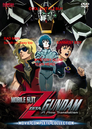
Let's take a look at the interstice image again (the 'Big Giant Head Relena Moment'), annotated for your pleasure.

Heero is centre, but not front, so we can identify him loosely as the Main Guy, but it's still that boyband lineup, and we can't really say that he's significantly more important than the rest. Relena is neither a true Sexy Danger to the boys here, nor is she swooning. She could be the 'symbol' except we have a big fat Earth nicely faded in the background, so she doesn't fit there either. And of course, Wing Gundam is the whole point of making the show, to make you buy some funky plastic stuff.
And rummaging around online, this style is also noticeably only something the Gundam Wing does, compared to the other franchises. Take a gander:


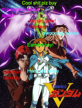


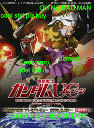


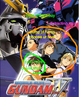
All of the above seem to follow the same rubric; the main character is promoted, and the others are there to be spicy interest to help with that promotion. A noteable exception would be Iron Blooded Orphans:

But that's only because they seem to have two main protagonists, and even then, this short guy is given a wee bit more attention, being faced forward and stood afore of his bro.
Overall, Gundam Wing tends to use the Boy Band Clump design, although there are some examples where Heero is promoted.


To finish, you may wonder if this is at all important, and the answer there in terms of fandom is 'not terribly'. But for media that seeks to sell to its audience, these shots are crucial advertisment; they tell that audience who to relate with, what to buy, and what the show is about. With that in mind, if Heero isn't promoted, then did Gundam Wing just get it... wrong?
I'm going to say no, because if you get your design completely wrong, the fans will just take the piss:

What Gundam Wing achieved, intentionally or not, was to ride the high wave of boyband popularity in the 90's and tap a shonen anime that would typically only be aimed at boys into a female market. And the results speak for themselves. It's a hokey little overdramatic and heavy-handed anime but it has endured, and it was the series which broke into the English-speaking market, enjoying a success which no other Gundam anime has managed to surpass.


Comments